Stacked measure charts allow users to compare multiple measures within a single stacked column chart.
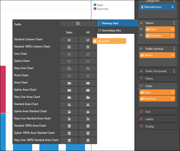
- Stacked measure charts are created by adding multiple measures to the primary axis in the Values drop zone
- Drop the measure in either Stacked Column Chart, or Stacked 100% Column Chart
How to Build a Stacked Measure Chart
STEP 1
Start by creating a stacked column chart, with one member hierarchy and one measure.
STEP 2
Drag a second measure to the Values drop zone, and add it to the Primary Axis, dropping the chip in either Stacked Column Chart, or Stacked 100% Column Chart.
STEP 3
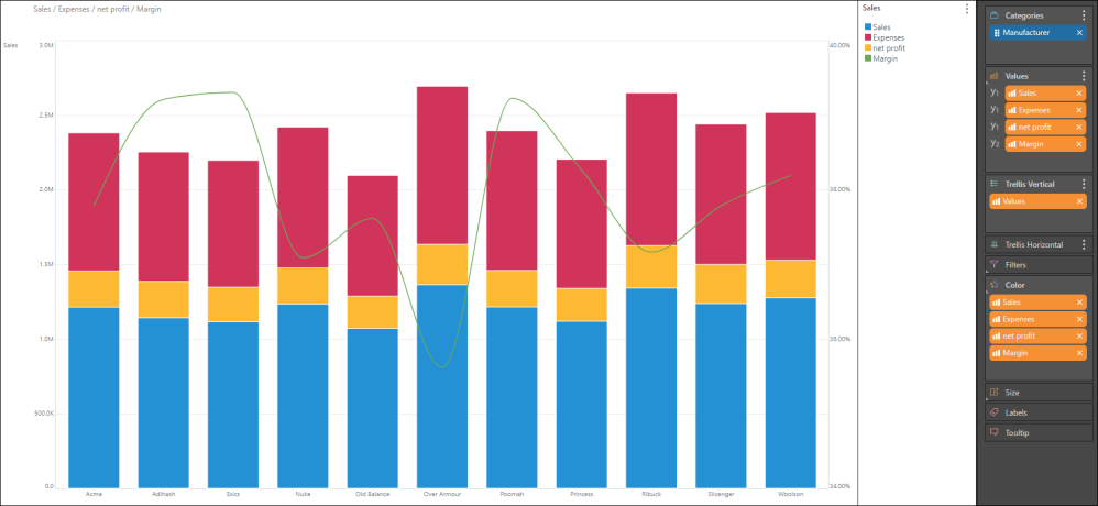
Continue adding the required measures. You can also add a measure to the secondary axis - in the example below, Sales, Expenses, and Net Profit were added to the stacked column chart on the primary axis. Margin, which represents percentages, was added as a spline chart to the secondary axis: